In today’s fast-paced digital marketplace, having a mobile tire shop that excels in e-commerce isn’t just about selling tires online—it’s about creating an engaging, responsive online environment that meets the evolving expectations of consumers. With the rise of mobile commerce, ensuring your website is optimized for all devices has never been more critical.

The Necessity of Mobile Responsiveness
What is Mobile Responsive Design?
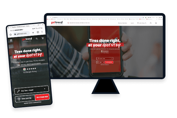
Mobile responsive design refers to the approach of making websites perform well on various devices such as smartphones, tablets, and desktops. It involves ensuring that elements like text, images, and layout automatically adjust to fit the device’s screen size and resolution.

Good Examples of Responsive Design for Mobile Tire Shops
Good tire sites will present tire information in a clear and visually appealing way, no matter the device.
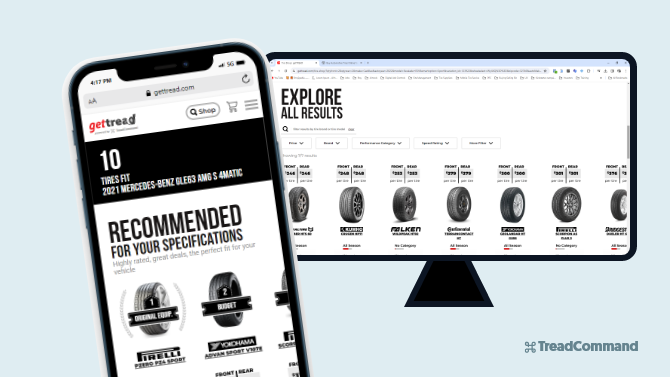
For example, the site below has used a sliding carousel of tire options on desktop, and smartphone. This makes it easy for users to simply “swipe left or right” through choices and easily see pricing/tire attributes and more.
Why is it Essential for Mobile Tire Shops?
As more consumers use mobile devices for everything from browsing to purchasing, a mobile-friendly website is crucial for capturing this growing market. Statistics show that mobile sales are steadily increasing, and businesses that aren’t optimized for mobile devices risk losing potential customers.
Just happened to search for mobile tire installers on google and came across getTREAD. The booking process was quick & easy. The service was even better, and thorough!
—ERKAN K, CUSTOMER AT GETTREAD.COM
How to make your tire site Responsive?
Making pages of an online tire shop responsive can be very complex, but let’s simplify it to the core points for sake of brevity:
- Adopt a Fluid Grid System
- A fluid grid layout uses relative units like percentages, rather than fixed units like pixels, to define web page elements. This means the elements of your website will resize relative to the screen size, making your site functional on any device
- Utilize Flexible Images and Media
- This involves making sure that your images and other media content are not fixed in size but can stretch or shrink depending on the screen size. You can achieve this by using CSS properties such as
max-width: 100%;andheight: auto;for your images. This allows them to scale according to the device width.
- This involves making sure that your images and other media content are not fixed in size but can stretch or shrink depending on the screen size. You can achieve this by using CSS properties such as
- Implement Media Queries
- Media queries allow you to apply different styles to your website based on the device characteristics. This is the cornerstone of responsive design, as it uses CSS to transform the layout based on the device screen size or other features. Media queries can dictate how a page should look on different devices (such as tablets, phones, desktops) by specifying particular styles for specific screen sizes
- Prioritize Touchscreens in your Design
- Given the prevalence of touchscreen devices, ensure that your website is touchscreen-friendly. This includes designing larger button sizes and making interactive elements easily accessible to accommodate finger taps instead of mouse clicks. Consideration for touchscreens should influence the overall interactive design of your site to enhance usability
- Optimize Typography
- Ensure that the text on your website is easily readable across devices. This might mean increasing font size for smaller screens or adjusting line spacing and font sizes dynamically based on the screen size. Use scalable units like ems or rems for font sizes to maintain relative sizing
- Simply the Design
- Simplifying your design can help improve loading times and the user experience on mobile devices. This includes minimizing the use of large graphics and having a clean, uncluttered layout. Focus on the key elements necessary for mobile users and hide less important elements on smaller screens
Enhancing User Experience
Improved Accessibility
Responsive design enables potential customers to navigate your website effortlessly, no matter what device they are using. This ease of access can significantly enhance user experience and satisfaction. You want to capture them wherever they feel like tire shopping, even if they’re sitting in the driver’s seat.

Faster Page Speed
Mobile users expect quick load times, and responsive design can help achieve faster page speeds by using mobile-friendly elements that require less data to load.

Take a deeper dive into page speed in this article: “What are Core Web Vitals & How Do They Affect My Mobile Tire E-Commerce Site?”
Boosting Your Sales Conversion Rate
Better Conversion Rates
A responsive mobile tire shop website adapts to the user’s device, providing a seamless experience that can lead to higher conversion rates.
Conversion rate: is just a fancy word to describe % of website visitors who make a purchase.
By simplifying the purchasing process, you’re making it easier for customers to buy your tires while they’re in the mood or on the go.

Check out this article for a deeper dive into “Conversion Rate Optimization for Mobile Tire Shop E-Commerce 2024”
Enhanced SEO
Google prioritizes mobile-friendly websites in its search results, which means that responsive design can boost your site’s SEO ranking, making it more visible to potential customers searching for tire-related services online
Staying Ahead of the Competition
Meeting Customer Expectations
Today’s customers expect a frictionless online shopping experience. By investing in responsive design, you position your mobile tire shop to meet these expectations and stand out in a crowded market.

Also important to note, we’ve been pleasantly surprised by the number of WOMEN who are successfully shopping online for tires at getTREAD.com. This is more true now with single moms being more common, as well as the work-from-home shift in the work force.

Very easy to make an appointment online. Same day service was available and our technician Kal was great. Kept us updated on his ETA, fixed our flat tire while we were able to stay at home with our two little kids instead of sitting at a shop waiting on the car. 10/10 recommend.
—JESSICA C, CUSTOMER AT GETTREAD.COM
Quick side note: The core demographic for mobile tire shop customers are:
- Work-from-home professions & At-home parents
- Car Enthusiasts
- Senior Citizens
For a deeper dive into target demographics, check out this article “Defining the Ideal Customer Profile for Mobile Tire Shops in 2024”
Leveraging Advanced Technology
Responsive design uses the latest web technologies to ensure that your website is compatible with all future devices and screen sizes, protecting your investment long-term.
Put your Tire E-commerce on autopilot, with TreadCommand
Say goodbye to clunky & cookie-cutter tire shop management software. Grow your mobile tire shop confidently with the best-in-class automated e-commerce tire platform that customers & operators love.
Conclusion
The integration of responsive design in your mobile tire shop’s e-commerce strategy is not merely a luxury—it’s a necessity in today’s digital age. By adapting to the needs of modern consumers, you can enhance user experience, increase your SEO ranking, and ultimately, boost your sales conversion rates. Investing in responsive design means investing in the future of your business, ensuring that your mobile tire shop remains competitive and relevant in the ever-evolving e-commerce landscape.